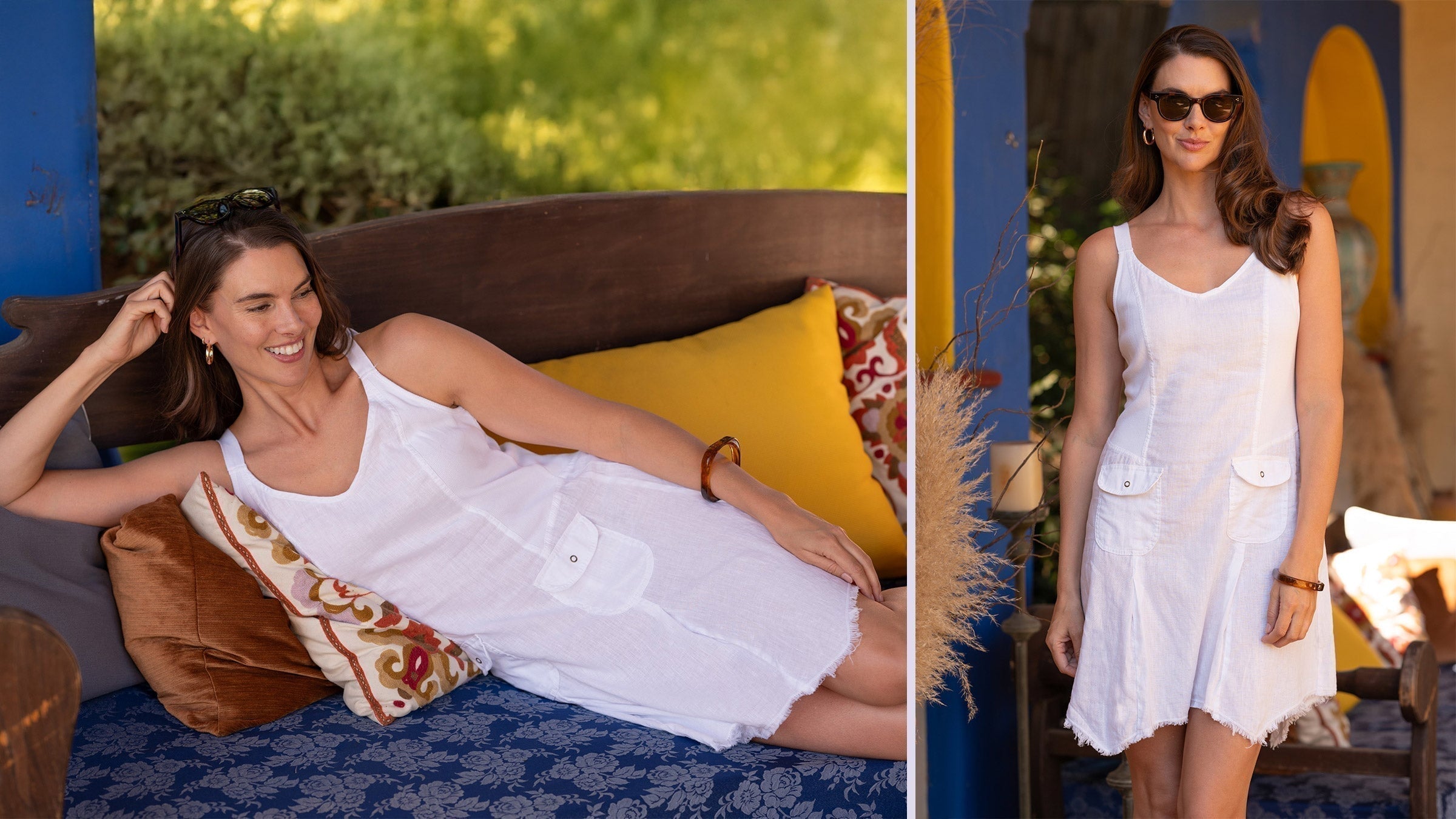
The Art of Color Theory
I used to be an all-black kinda gal. Foolproof and flattering, I’d always gravitate towards the tried-and-true dark hue. As I got a bit older, I started shopping according to colors I was drawn to and my world completely changed.
If you’ve ever slipped into a vibrant outfit that made you feel unstoppable, or wrapped yourself in soothing neutrals that brought a sense of calm, you’ve experienced the magic of color theory.
But there’s more to this fashion trick than meets the eye. Understanding the relationship between colors can not only enhance your style—it can completely transform how you feel in your clothes.
Welcome to the art of dressing with color.
The Color Wheel: Your Secret Styling Tool
Let’s start with the basics: the color wheel. Designers have used this tool for centuries to craft everything from breathtaking runway looks to the perfect red-carpet moments. The wheel is divided into three key groups:
● Primary colors: Red, blue, and yellow—these are the foundation of all other hues.
● Secondary colors: When you mix two primary colors, you get this group—think orange, green, and purple.
● Tertiary colors: These are the in-between shades like blue-green or red-violet, adding dimension to any palette.

So, how does this impact your wardrobe?
It’s all about relationships. Complementary colors (those directly opposite each other on the wheel) like bold orange and electric blue, create instant, eye-catching contrast. Analogous colors (those next to each other) like serene shades of blue and green, offer a more sophisticated, harmonious look. This is the science behind why certain combinations just work.
Warm vs. Cool: Set the Mood with Tones
Colors aren’t just visual—they evoke emotion. Warm colors—like fiery reds, vibrant oranges, and sun-soaked yellows—project energy and confidence. Slip into a tailored red suit and you’re signaling power.
On the flip side, cool tones—like deep blues, soft greens, and regal purples—are perfect for a more calming, elegant aesthetic. Think of these as your “zen” tones for when you want to channel ease and grace.
The Quiet Power of Neutrals
Ah, the neutrals. Understated yet indispensable, these shades—black, white, grey, and beige—are the backbone of a polished wardrobe. Neutrals allow you to play with bold accents without overwhelming your look. A crisp white blouse or a sleek black dress can elevate even the most daring color combination, giving you an air of effortless chic. Or, go for monochrome and show that less really is more.
Finding Your Personal Palette
When it comes to dressing in colors that truly flatter, understanding your skin’s undertone is one of the most crucial, yet often overlooked, steps. While your skin tone is the visible surface color, your undertone is the hue that lies beneath and remains consistent regardless of season or sun exposure. Knowing whether your undertone is warm, cool, or neutral can unlock an entirely new world of color combinations that enhance your natural beauty rather than competing with it.
Figuring out your undertone can be as simple as observing how your skin reacts to certain colors. The vein test (where blue or purple veins indicate a cool undertone, while greenish veins point to warm) is often helpful. Do gold or silver accessories flatter you more? Does your skin glow next to bright white or does off-white work better? Whether you’re building a capsule wardrobe or trying to stand out with statement pieces, knowing your undertone ensures that your outfits not only look good on the rack but make you feel unstoppable in your skin.or
experimenting with gold and silver jewelry, you can curate a wardrobe that enhances your natural complexion—-a wardrobe that works in harmony with your undertone brings your skin to life, allowing you to feel both confident and effortlessly chic.
Warm undertones typically have a golden, yellow, or peachy base, and are complemented by colors like earthy browns, rich reds, vibrant corals, and olive greens. Think of warm hues reminiscent of autumn leaves or golden sunsets—these tones radiate off the skin and bring out its natural glow. Meanwhile, cool undertones, which often feature pink, blue, or purple undertones, thrive in shades of icy blues, jewel-toned greens, and berry reds. Neutral undertones fall
somewhere in between, and people with this skin type can often pull off a wide spectrum of colors, from soft pastels to vivid primary colors.
Break the Rules—With Confidence
Of course, the best part about fashion is there are no real rules. The beauty of color theory is that it gives you a foundation, but the real magic happens when you start experimenting. Want to pair unexpected shades together? Do it. Love the idea of mixing prints? Go bold.
Fashion is about expression, and color is one of the most powerful tools you have to tell your story. At the end of the day, what you wear should reflect how you feel and who you are. So whether you’re going for a daring, saturated look or a calming, minimalist vibe, use color with intention—and a little creative fearlessness. In fashion, color isn’t just a detail—it’s the whole mood.
- Eden ( Your personal stylist )


